
More to the point, have NuTerra, LLC make your website responsive; not just to users, but to what they are using. Your website loads into smart phones and tablets so you need to deliver a customized device experience.
What does "responsive" mean?
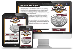
Essentially, it means your site will detect what device it is loading onto and it will respond to that device. For example, if it's loading on to a specific smart phone, the site may not load certain graphic elements so the site loads faster. And that is the end result, sites load faster on to the specific device it is interacting with. Faster loads means happier users and ultimately, happier customers.The other element is how it looks. NuTerra will build the responsive site to load into the tablet with fluid viewing dimensions. Essentially, this means the site will load to the size of the screen; making the user experience better.
Why is this important?
As a business owner, we don't have to tell you the need for making your product accessible to half of your customers. Now over half the Internet users look at your site with their phones. Something you should be responsive to.It is time to have NuTerra, LLC update your site. Contact NuTerra now to see how your site can be responsive!